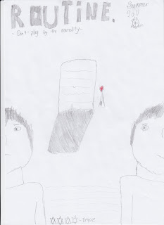
 This is a sketched flat plan for my poster that will accompany my trailer and magazine cover. in this i have the name of the film writ across the top of the page in big letter shaded in to help it stand out. Next to this i have the release date of the film and the logo of my production company. There is a tag line underneath the name of the film to add a bit more to the poster and to give more away about the film. In the middle of the page there is a picture of a tombstone, this relates to the main protagonists mother as she dies at the start of the film. the one red rose next to the grave connotes love. The whole color scheme on this poster will black and white with the exception of the red rose to show hope. Either side of this tombstone there are two half's of the main characters face. one shows him frowning the other shows him smiling. This connotes towards to the audience that he could have a split personality. Between both of this shots of the character it will have the small print that is usually seen on a film poster, this will include the director, the actors etc. there will also be a made up review showing a star rating for the likes of Empire magazine a very well established Film magazine.
Drawing out a plan for my poster allows me to get all the ideas i have in my head onto paper and makes it easier when i come to take the pictures for this poster.
No comments:
Post a Comment