Monday, 18 April 2011
Sunday, 17 April 2011
Final Cut Trailer
This is my final cut for my film trailer, "Routine". Before posting this post i had problems with the soundtrack sounding too distorted when i uploaded it to youtube. I sorted this out by lowering the levels with the soundtrack so that it sounded clearer.
Thursday, 14 April 2011
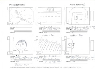
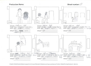
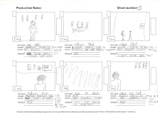
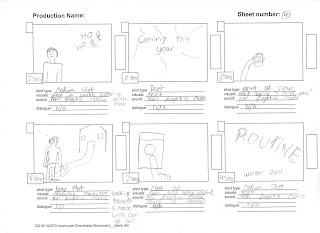
Animatic
Here i have created a Animatic to show that i have produced a storyboard. In this video each part of the storyboard shown lasts for how long each shot will in the trailer that i am going to create. I think creating a Animatic is a good way to show my ideas that i am wanting to do for my trailer.
Magazine Flat Plan
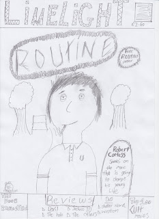
As well as a film trailer i also have to create a magazine cover and a poster to promote the film. I have drawn a flat plan for the magazine and scanned it into the computer so i can insert it into this blog. I have decided to put a picture of the main character on the front smoking a cigarette with bags under his eyes to show his stress. using a medium close up allows me to put the main character in the middle of the page and have his eyes directly in the centre so that it feels as if he is looking right at the potential buyer. Including a banner saying free poster may encourage people to buy the magazine as they are receiving a free gift. i have placed the sub heading in a tombstone with the actors name in bold writing at the top of the headstone to convey death. It could relate to the story line of the movie as the main characters mum dies. i have included my logo in the left hand corner of the page as then people will know who the production group are. having items at the bottom of the page such as "top 100 cult movies" conveys to the style of film which i am creating, as my film has some styles of a cult movie in it.
Logos
Within Adobe Photoshop CS4 i have created some logos .
Copyright Letter
Dear Copyright Holder
I am an A level student and I am writing to request your permission to use one track from the latest album by Foals, Total Life Forever.
The track I wish to use is "Spanish Sahara", track 5 on the album. With your permission this track would be used in my current A-Level Media Project, acting as a soundtrack, this involves creating a Film Trailer, as well as producing a poster for the film and a film magazine cover.
If I received your permission this track would be viewed by my peers, teachers and the OCR exam board, it would also be uploaded to a public video website in order for it to be embedded into my personal blog for research and planning.
The Artist and your Company would be fully recognised throughout pre-production and the final trailer itself. A copyright notice, with wording supplied by you can be included in the records of the project. If this is required, please send full details.
Yours Sincerely,
Conor Gower
Poster Flatplan
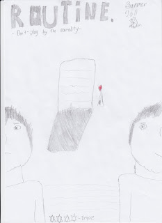 This is a sketched flat plan for my poster that will accompany my trailer and magazine cover. in this i have the name of the film writ across the top of the page in big letter shaded in to help it stand out. Next to this i have the release date of the film and the logo of my production company. There is a tag line underneath the name of the film to add a bit more to the poster and to give more away about the film. In the middle of the page there is a picture of a tombstone, this relates to the main protagonists mother as she dies at the start of the film. the one red rose next to the grave connotes love. The whole color scheme on this poster will black and white with the exception of the red rose to show hope. Either side of this tombstone there are two half's of the main characters face. one shows him frowning the other shows him smiling. This connotes towards to the audience that he could have a split personality. Between both of this shots of the character it will have the small print that is usually seen on a film poster, this will include the director, the actors etc. there will also be a made up review showing a star rating for the likes of Empire magazine a very well established Film magazine.
Working in Final Cut Express
This was my 1st cut for the Promo video. i felt like it was missing certain characteristics, like a logo for example. and in general i fell that it just need tiding up so i have created a final product even including my actual logo that i will be using for my film trailer.
This is my final version of my trailer.
i feel doing an activity like this really helps my skills development and will give me the necessary time to get to grips with Final Cut Express before actually editing my own trailer. i enjoyed doing this activity and although i enjoyed using Garage Band i am not going to use this in my Final Trailer.
Soundtrack Change
Storyboard
Wednesday, 13 April 2011
Skills Development
I recently went on a trip with the media department to develop my skills when using final cut pro and to get used to using the cameras at a semi professional level. when using the cameras for every shot which we wanted to capture we had to zoom fully in and focus so the shot would become clear if we had to use zoom. we also got told that if using the cameras outdoors we had to use a filter on the camera so that the shots we were taking were not too bright. we then got showed how to attach the gun mic and how to change the level of sound it was picking up, we did not use the gun mics when going out to get some footage, however knowing how to use a gun mic will help when recording the sound in my trailer.
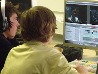
The trip took place at Teesside University where we got briefed on how to use the cameras and how to achieve the shots which we wanted. We had to go and film some footage which could be used in a video to promote the University, showing all the area around it. This activity was set just for us to get used to using the cameras a
nd creating steady shots.
We then returned back up the class r
oom where we then got showed everything on final cut pro which gave us the skills needed to then go on develop a short video promoting the university. I find this rather helpful to my progression with my film trailer and now feel that I could use final cut pro to the standard that I am trying to achieve.
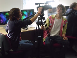
After this we then got given a variety clips taken from the film Gladiator and we had to then create our own trailer by dropping clips into the timeline and adding certain clips. I feel that me my partner which I was working with during this activity created a very good trailer for the amount of time that we had on it.
Attending this trip has very much helped my progress into knowing how to make a trailer. I have came out of it with a understanding on how to use final cut pro and how to make shots look professional.
Here are some images of me and david working on final cut pro and learning how to use the cameras.
Audience Research
i found this video through http://www.uktribes.com/ a site which looks into the different type of youth tribes that are existent in Britain today.
Below is a audience profile for Adulthood one of the films that i feel has a similar feel to my film. i got this table off http://pearlanddean.com/. i feel that this piece of information is very helpful in choosing my target audience age.

This is a trailer for Kidulthood, I feel that the style of this film is very similar to what I am trying to achieve within my trailer. Similar to Kidulthood my film is focused on the youth of Britain however I see Kidulthood as a stereotypical view of east London’s youth gangs, where as my film is going to be very northern and instead of being aimed around gangs it will just be aimed around one teenage boy. I feel that this trailer portrays youth very well within the scenes shown and the music used within it. The way in which the youth of Britain is shown in this trailer gives off a negative stereotype of how teenagers act in east London. In my trailer I will only include one moment of stereotyping and this is a scene where the male protagonist gets jumped by a group of “Chavs”. The way in which the Kidulthood trailer attracts a young audience is by quick editing pace and including issues which may affect them. So I shall be trying to portray issues that a teenage audience can relate to.

This is a film taken from the new film following the life of Howard Marks aka "Mr Nice" a notorious drug smuggler from Island. Placing the lead actor on the left hand side of the poster means that he is the part which will be noticed by the audience. This is also backed up due the close up used of the actors face, as it stands out. Due to the majority of the poster being black and white it makes the blue in his glasses stand out as it shows a swimming pool. As well as the reflection in his glasses being blue the actors names have been put in blue to also attract attention. i feel that when i make my film poster i want it to give off the same effects as this poster as i feel it just oozes with style and gives off an impression of cool.
 This edition of Empire Magazine uses a character from Trainspotting as the focus of the front cover. They have done this by including a medium shot of the character with a high angle camera shot to make it look like he is looking up at the camera. They have also made sure that the character is looking straight into the camera. This could of been done for a number of reasons but i feel that the main reason is so that he is staring right at the audience to help them relate to him. It could also catch peoples eyes when in a shop which may make them decide to buy the magazine. The tag line underneath the main image of this character reads "in yer face" which could connote that the film is very in your film along with this character. Big film fans will be interested by the subheading claiming that Trainspotting's is the hippest movie of the year. Including quotes like this will attract a large audience to buy the magazine as they will want to know what the movie is about and why is it the hippest movie of the year.
Looking at forms of promotion for films has let me know the dynamics and the technical codes within a film trailer, a film poster and a film magazine.


